Cookie Banner
Objective
Mozilla.org serves a global audience. This means we adhere to regulations from multiple jurisdictions.
At Mozilla, user privacy and data control always come first. This commitment shaped how we approached features like cookie banners; not just as a compliance requirement, but as a way to transparently inform users about what data we collect (and what data we don’t collect).
Our goal was to design a clear, user-friendly cookie banner that empowered visitors to understand and manage their data preferences, ensuring they had full control over their browsing experience.
Discovery Phase
To tackle this challenge, I first studied international laws and Mozilla’s legal obligations, ensuring I fully understood the scope of the problem.
Next, I created diagrams and charts to evaluate solutions that balanced legal compliance with a seamless user experience. I also analyzed our website’s use of headers, footers, and pop-up banners to determine the best placement for the cookie notification, ensuring it was highly visible without disrupting the user experience or creating conflicts for developers.
Iteration
After compiling a visual guide of industry standards for cookie banners, I began iterating on the best solution for Mozilla.
I determined that anchoring the cookie banner to the bottom of the browser window was the most effective approach. This decision was based on existing design patterns used across mozilla.org. I wanted consistency in implementation while avoiding conflicts with our top-of-page notification banners, which change throughout the year. By keeping the cookie banner’s placement evergreen and unobtrusive, we maintained both compliance and a seamless user experience.
Research
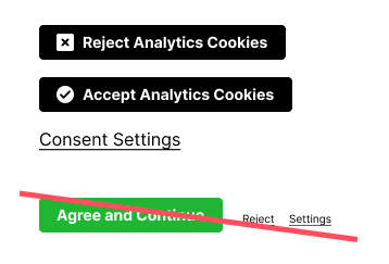
While examining established cookie banner patterns, I noticed significant inconsistencies in the design approach companies took to implementing these banners, particularly in the wording of the "accept" and "reject" options.
To address this, I conducted a usability study where participants from our global target markets interacted with the cookie banner. I then asked them to explain what they believed the different button labels meant.
The study revealed key insights:
Terms like “necessary” and “essential” caused confusion, as users weren’t sure if these referred to all cookies or just non-third-party cookies.
Some participants feared that rejecting cookies outright would break the website, leading them to select “accept all” out of uncertainty.
Through testing, we identified wording that provided the clearest understanding for users, ensuring their expectations aligned with the actual functionality of the banner. This helped create a more transparent, user-friendly experience while maintaining compliance.

Insights
Users with little to no technical expertise often perceived terms like “essential,” “necessary,” and “third-party” as jargon, making it difficult for them to understand what would happen when selecting these options. While these terms are legally defined, they didn’t always provide enough clarity about the actual user experience.
Another key insight was the misleading nature of “reject all” since necessary cookies cannot be rejected. This phrasing caused concern among some participants. Many worried that rejecting all cookies would break the website, leading to unnecessary hesitation or confusion.
By refining our language, we aimed to make the cookie banner clear, transparent, and user-friendly, ensuring users felt confident in their choices without misunderstanding the impact of their selections.
Conclusion
Examining existing cookie banner solutions for this project was an eye-opening experience, revealing that many banners failed to fully comply with international standards.
To better understand regional differences, I used a VPN to simulate browsing as both a European user and an American user. The differences were striking:
In the EU, cookie banners were more consistently present, visually standardized, and interactive.
In the U.S., banners were used less frequently, and dark patterns were more prevalent—including making the "accept" button more prominent than the "reject" option or requiring users to opt out through complex interactions.
This research underscored the importance of designing a transparent, user-first cookie banner, ensuring compliance without misleading design tactics. By prioritizing clarity and fairness, we could create a more trustworthy and user-friendly experience.


