Protocol Design System
About the Project
Protocol is the design system that powers mozilla.org, ensuring consistency and usability across the site.
As a UX designer on the project, my role was to:
Collaborate with developers to ensure seamless implementation.
Design and develop new components to enhance the system.
Build a Figma Library, allowing designers to easily prototype using standardized components.
This work helped streamline the design process, making it more efficient, scalable, and accessible for the entire team.

Color Accessability
A key challenge in managing the UI and UX of the Protocol design system was balancing brand individuality with reusable components. We needed a system that allowed each Mozilla brand to maintain its unique personality while ensuring consistency, usability, and ease of implementation across the site.
One of our most effective solutions was leveraging color. By carefully integrating brand-specific palettes within shared components, we maintained visual distinction while keeping the system cohesive.
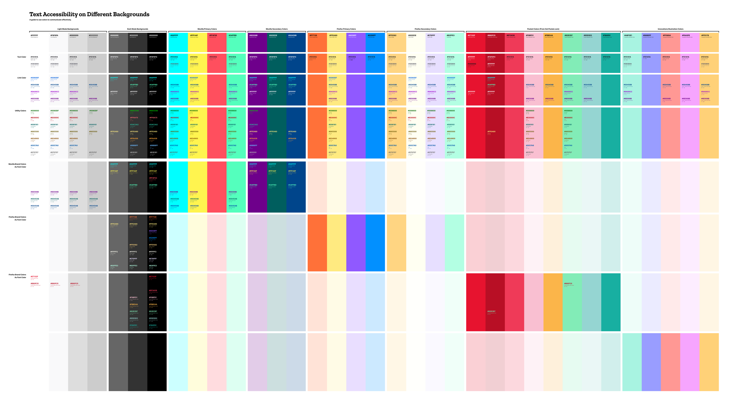
To ensure accessibility, we conducted extensive testing and iteration, making sure that all approved color combinations met at least AA contrast standards for readability. This approach allowed us to create a flexible yet consistent design system that worked seamlessly across multiple brands.
The color audit resulted in a series of artifacts and documentation that served as cheat sheets for visual designers. These resources made it easier to explore creative ways to use brand assets while ensuring consistency and accessibility in marketing materials for mozilla.org.
By prioritizing color accessibility, we demonstrated that inclusive design can be straightforward, even for designers without formal accessibility training. With the right resources, we empowered our team to create designs that are visually compelling, brand-aligned, and readable for all users.

User Insights
Protocol design system is an open source project, but its primary users are designers and developers within Mozilla.
To continuously improve the system, I conducted feedback sessions with visual designers to understand their needs and challenges. These user interviews helped us identify areas for refinement, such as typography and spacing systems, ensuring our components and documentation were more intuitive, flexible, and effective.
By actively listening to our users, we made targeted improvements that enhanced the usability and adoption of Protocol, making it an even stronger resource for the Mozilla community.
Responsive Typography Scaling
After meeting with Figma Library users, we identified a need to refine typography and spacing for better consistency and usability.
Through collaboration with developers, I discovered that our system already used a base-eight scale for component margins. Building on this, I experimented with typography to create a scalable system where font sizes, padding, and margins all adhered to the same structure. This ensured a harmonious, readable, and flexible design across mozilla.org.
While our production units were in rems, I also conducted experiments using ems to explore how we could improve scalability. This would allow the website to adapt proportionally across different screen sizes, from mobile to large desktops, creating a more fluid and responsive experience.
Building on the color accessibility documentation, I also created guidelines and documentation for font sizes and line heights, ensuring optimal readability of our custom typefaces on mozilla.org.
Once documented, this typographic system was implemented in two key places:
GitHub tickets, where developers could integrate the updates into production.
Figma Library, using variables to make it easily accessible for designers.
Reflections & Takeaways
Protocol was the third major design system I’ve worked on, following my experiences at GE Aviation and BCBSLA. Yet, every project brings new learnings. On Protocol, I saw firsthand how inter-team collaboration and user interviews were essential to building a truly adaptable system.
This was also my first design system built within Figma, where we leveraged variables and components to minimize the need for designers to detach instances. By prioritizing usability, we ensured our team had all the resources they needed to work efficiently and consistently.