Turning Red
About the Project
Did you know that the animal in the Firefox logo isn’t actually a fox, it’s a red panda? (Just like Mei, the main character from Turning Red.)
When Pixar’s Turning Red was about to launch, Mozilla partnered with Disney and Pixar for a fun cross-promotion celebrating our shared red panda love. I had the opportunity to review the mockups before development, ensuring the designs aligned with our brand and user experience standards before they went live.
SVG Animation
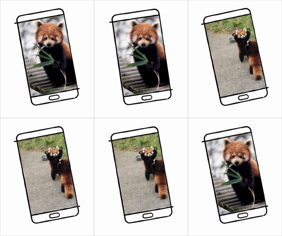
The UI design for this project was meant to evoke playfulness and wonder, drawing inspiration from notebook sketches and the visual aesthetic of early 2000s webpages.
Coincidentally, Mei from Turning Red and I are the same age. In the early 2000s, when the movie is set, I was just beginning to build my first web pages. I vividly remember the animated GIFs, quirky layouts, and unpolished yet charming designs that defined that era.
With this project, I wanted to recreate that sense of nostalgia and discovery, but with the performance and usability of today’s web. To achieve this, I:
Ensured all animations were SVG-based for fast loading and smooth performance.
Designed animations to be user-triggered, allowing interactions to feel intentional rather than overwhelming.
I submitted animated prototypes to both our developers and the original designers. Together, we refined which animations to implement. Our goal was to strike the perfect balance between surprise and delight, ensuring users felt engaged without distractions that interfered with readability.
Accessibility Concerns
The W3C provides extensive guidelines on animation best practices to ensure a positive and accessible user experience.
One key consideration when using animations is their potential impact on users with motion sensitivity. To address this, I worked with our developers to implement the “prefers-reduced-motion” media query, allowing users who opt out of animations to have a static, more comfortable experience.
Additionally, some proposed animations were cut from the final design. For example, an early concept featured constantly moving borders around images, resembling a film frame. However, during testing, this effect made the images feel jumpy and distracting, even for users without a history of motion sensitivity.
Based on these findings and W3C recommendations, I proposed removing the animation entirely to preserve the page’s readability and accessibility, ensuring a more inclusive experience for all users.


